If you’re a fan of Your Life in Numbers, our web app visualizing how much the world has improved in your lifetime, then you should also check out Poverty Clock.
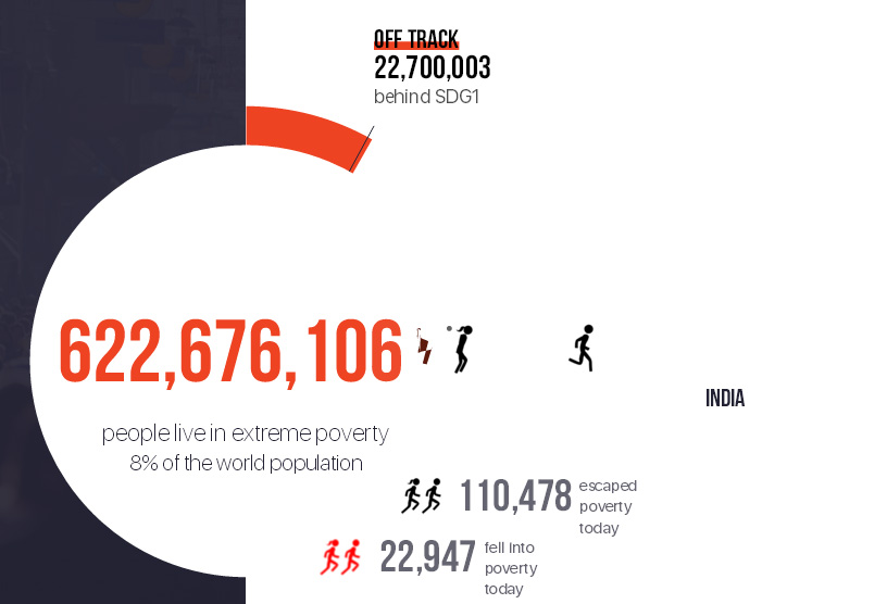
Poverty Clock visualizes the approximate state of world poverty in real time, showing one person escaping from extreme poverty every second. It estimates where each person moving out of poverty lives (Indonesia, India, Algeria…) and what their gender might be, using statistical averages.
The visualization also shows the rate at which people fall into extreme poverty. Happily, the number escaping poverty dwarfs the number falling into it.
The team behind Poverty Clock - World Data Lab in Austria - describes their methodology this way:
“The World Poverty Clock uses publicly available data on income distribution, production, and consumption, provided by various international organizations, most notably the UN, World Bank, and the International Monetary Fund … Our data covers 99.7% of the world’s population. We also model how individual incomes might change over time, using IMF growth forecasts for the medium-term complemented by long-term ‘shared socio-economic pathways’ developed by the Institute of International Applied Systems Analysis in Vienna, Austria.”
Perhaps my favorite part of this website is that it tracks how many people have escaped poverty since you opened Poverty Clock in your browser. Literally thousands of people have left poverty behind them since I opened it in mine.
http://humanprogress.org/blog/someone-escapes-from-poverty-every-second?...


